PSA: Fused has had a bit of work done.
If you’ve gotten an email that looks different than usual, or your customer dashboard doesn’t look like you remember it, there’s nothing to be concerned about. We’re the same service offering the same easy student bills as always, we just have a brand new look.
That’s basically it. We didn’t want you or anybody else to worry about being scammed or spammed ‘cause they received an unfamiliar email, or were nervous about adding payment details to a page that looked different than they remembered.
If you want more info, keep scrolling.
What should it look like?
This is the updated Fused logo
You'll see this on emails, your customer dashboard and any other communication.png?width=1500&height=750&name=Untitled%20design%20(7).png)
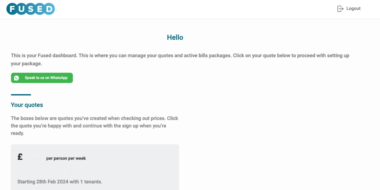
And you'll see some new colours, too. Here's a quick of how they look in your Fused dashboard.

What’s new?
Same five-star service as always, just better looking 😎
- There’s always been a team of experts behind the scenes to give you the best possible, rated-excellent-on-Trustpilot service, and honestly it was about time our website and brand did that hard work justice.
- All the work done makes it easier for you to understand our services, and easier to share the info with your housemates.
- And honestly, it’s a lot nicer to look at.
Check out our new explainer videos while you’re here 👀
Chisanga, Kira and Oliver are here to explain Fused’s bill-splitting, Unlimited Energy and broadband services for you. Check them out!
Bill splitting for students explained Unlimited Energy for students explained Broadband for students explained


